Loading cart…
No products in the cart.

Original price was: $599.00.$299.00Current price is: $299.00.
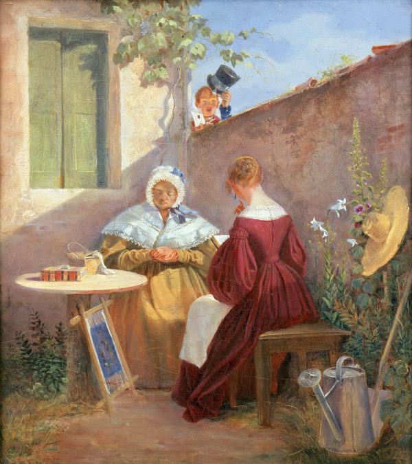
Explore The Love Letter by Carl Spitzweg as a hand-painted oil reproduction, painted on canvas with layered oils, subtle surface variation, and close attention to the original composition.
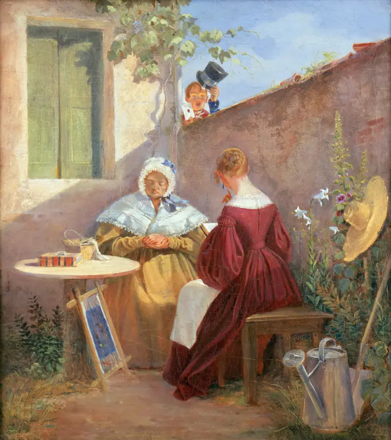
Carl Spitzweg gives The Love Letter a distinct identity through the arrangement of forms, space, and emphasis across the canvas. Its visual order encourages the eye to move between the principal forms and the surrounding space, revealing how balance and emphasis hold the scene together.
The character of the painting emerges through Carl Spitzweg’s control of tonal contrast, color relationships, and visual weight. The placement of visual weight across the surface keeps the focal area prominent while allowing secondary passages to remain meaningful. The result is an image whose mood and structure become richer as the viewer notices the connections between its larger and smaller passages.
Hand painting the image in oils preserves the importance of surface, tonal transitions, and physical brushwork. This process creates depth and surface variation beyond printed reproduction, resulting in an artwork intended for viewers who appreciate patient, traditional craftsmanship.
Empty walls flatten a room. A classical artwork restores structure and visual hierarchy. One painting defines the space, anchors furniture, and establishes identity.
Worldwide shipping included. Each painting is produced to order and safely packed for international transport.
All payments are encrypted and processed through trusted payment providers.
Real brushwork, layered oil paint, and durable pigments on museum-quality canvas.
If the result does not meet expectations, return it for a full refund.


Your artwork is painted on premium cotton canvas, then shipped safely rolled in a rigid tube with extra blank canvas border — ready for stretching or framing locally.
Select a handcrafted frame and we’ll deliver your painting fully assembled, protected, and ready to hang.
For safe shipping, framing is available up to a maximum size. Larger sizes will automatically disable the frame option.


Choose “Stretched” to receive your canvas mounted on wooden stretcher bars — perfect if you’ll frame it later or display it as-is.
Gallery Wrap is a deeper, 1.5" style stretcher. The canvas wraps around the sides and is stapled on the back for a clean, modern, frameless look.
We ship with UPS, FedEx, or DHL straight to your door. You’ll receive a tracking number as soon as your order leaves our studio. Typical delivery is 5 to 7 days after dispatch; large, framed, or stretched pieces may take longer depending on the safest shipping route.


Unframed canvases are protected with a film, carefully rolled, and secured inside a rigid shipping tube.

Stretched, Gallery Wrapped, and Framed paintings are wrapped, cushioned with foam protection, and boxed for safe transit.
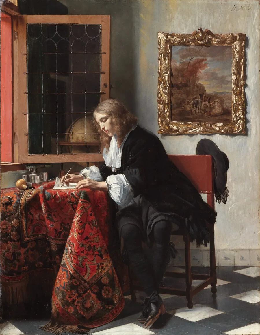
Man Writing a Letter
Gabriel Metsu, c. 1664
The gallery list
Every painting is already 50% off. Join the list and we will send you an extra $15 code, plus first access to new collections.
No spam. Unsubscribe anytime. · Privacy Policy
Welcome
Your $15 code is on its way. Explore the gallery while you wait.